Boroondara Arts
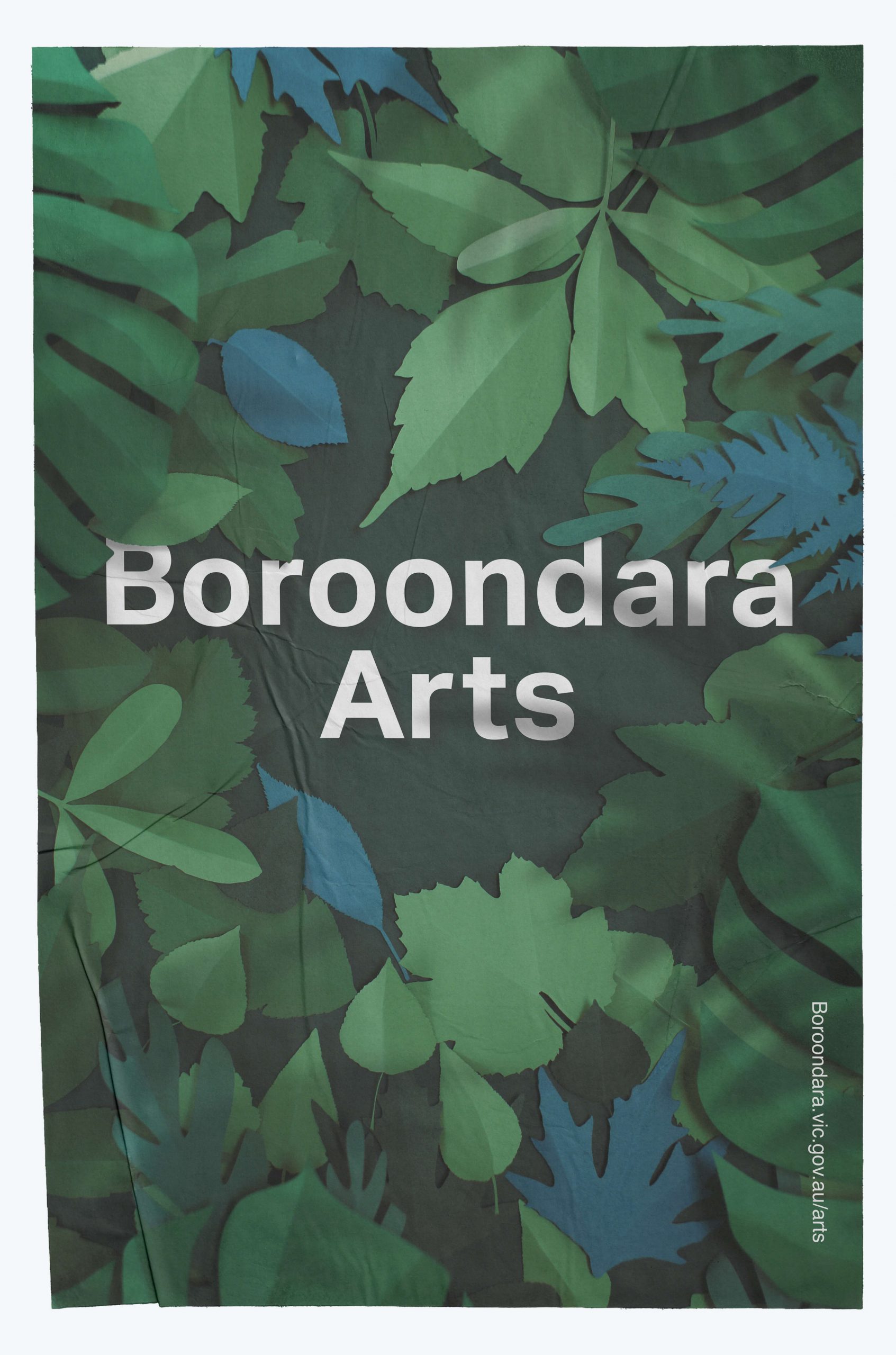
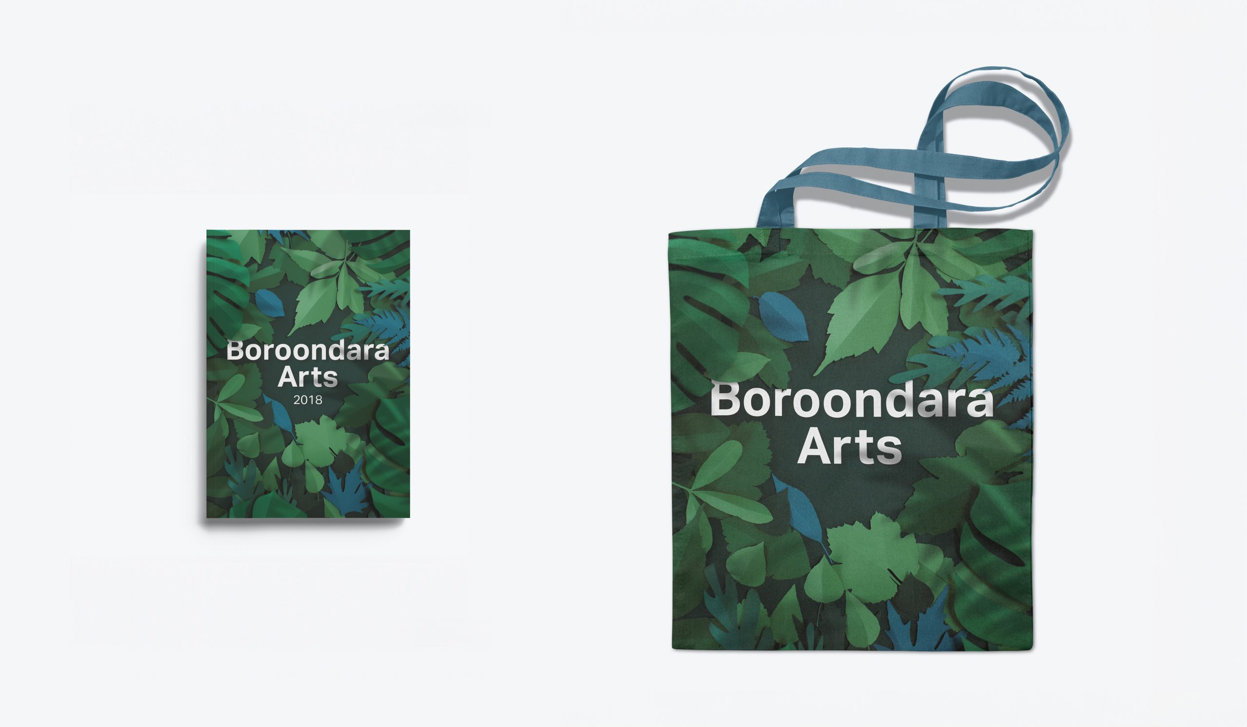
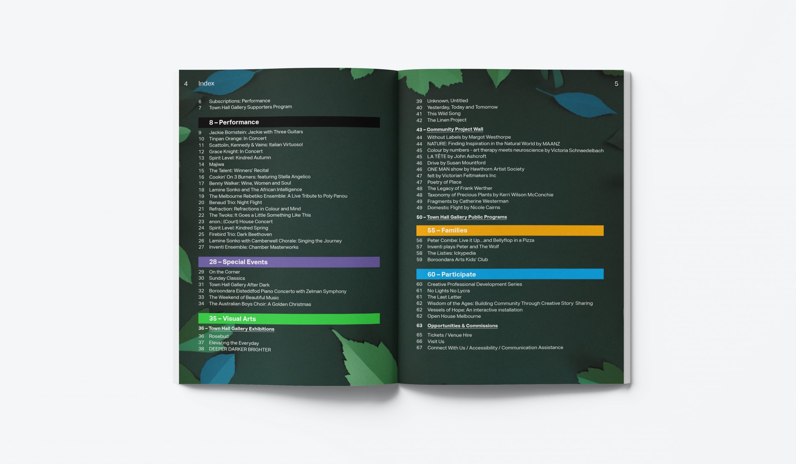
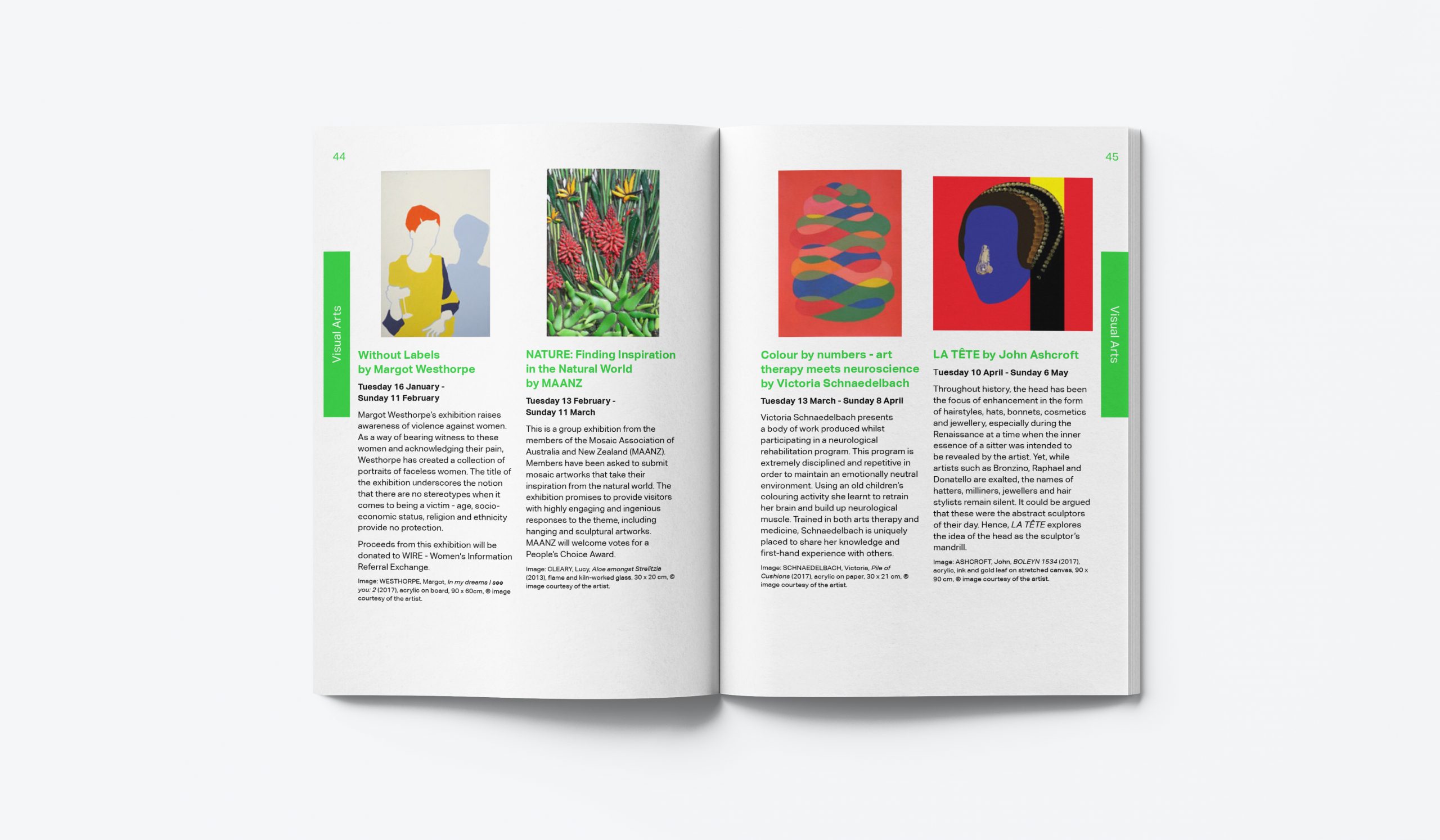
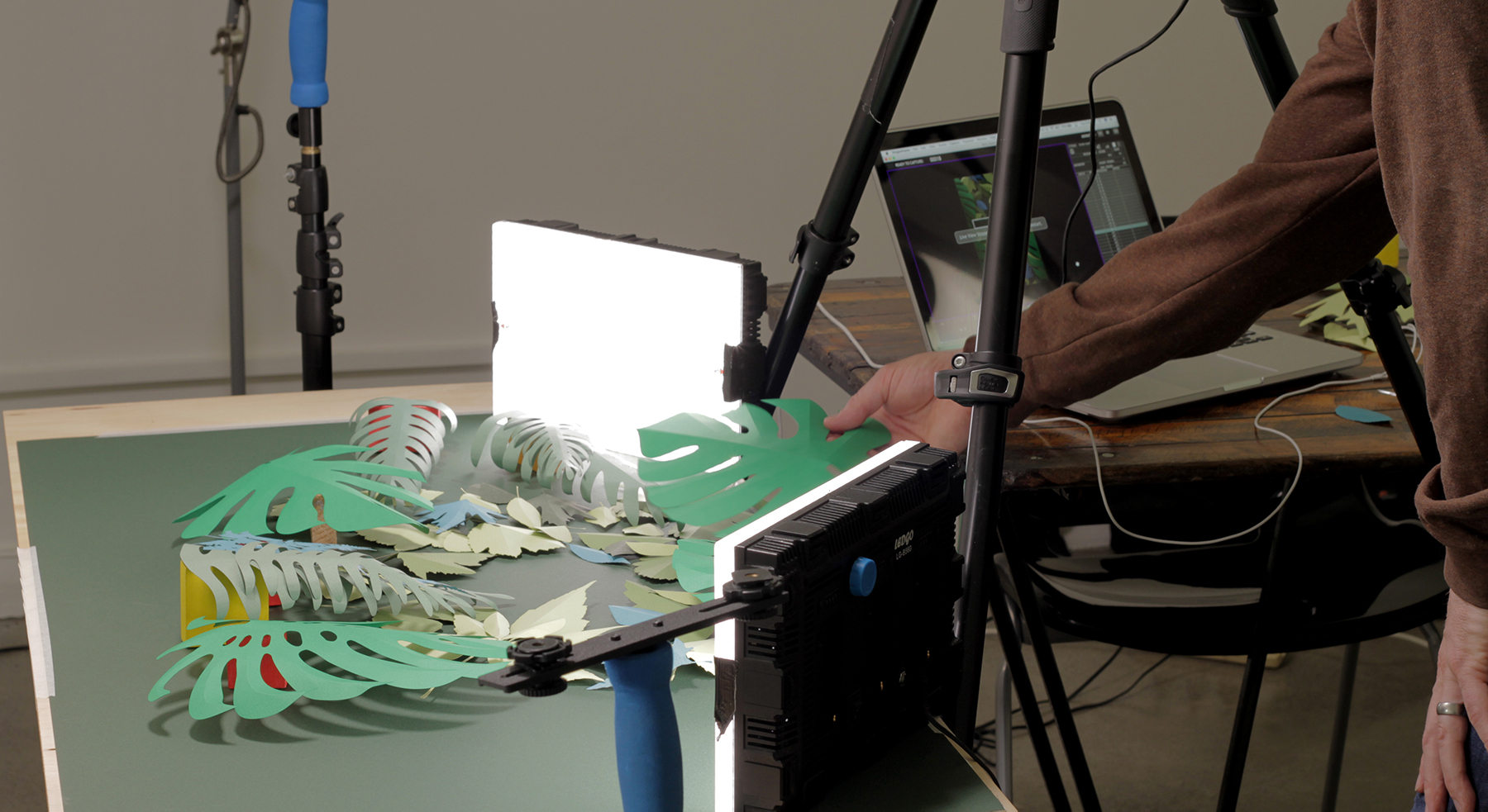
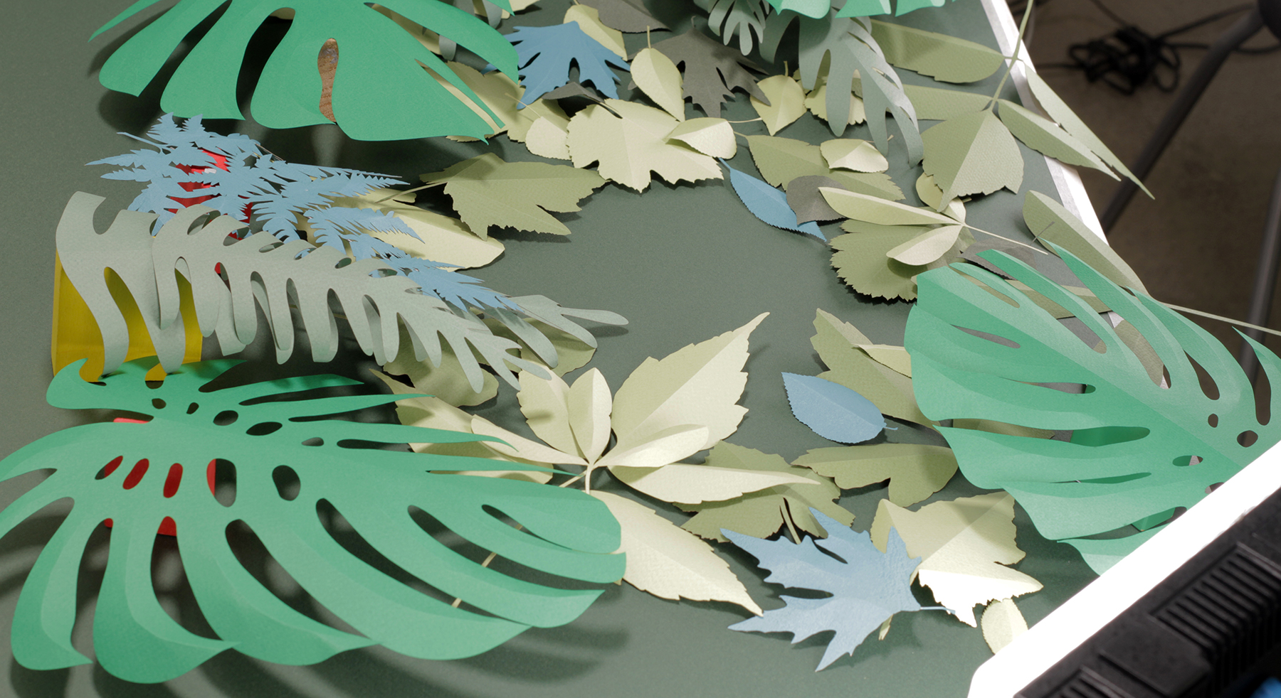
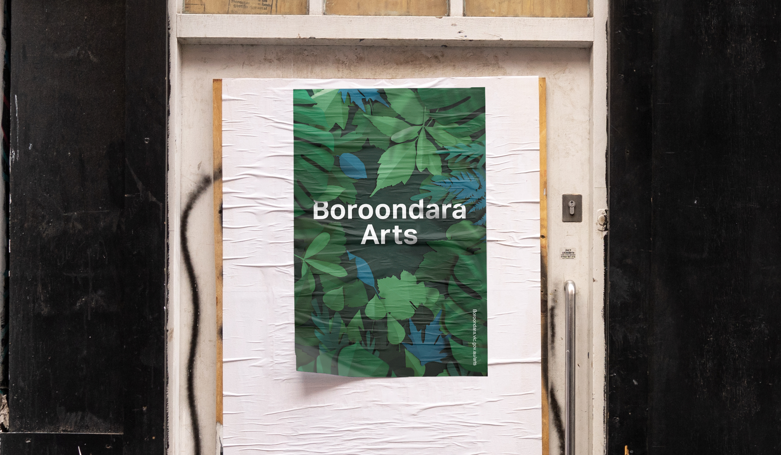
While working for Forde and Nicol we were approached by Boroondara Arts to design a campaign and identity for their annual arts festival. The Woi-wurrung word ‘Boroondara’ means ‘Where the ground is thickly shaded’, This informed the brief for the visual identity using papercraft and stop motion animation to illustrate the meaning. The identity was applied to posters, programs merchandise, and digital screens for the year.
Client
Discipline
Key-Art, animation, print & digital